 |
| A dark setting gives this lovely stained glass piece all the more power. |
Contrast works by heightening the perceived difference between sensations. Suppose it’s a sweltering summer day, and you walk off the scorching sidewalk into an air-conditioned building. You, being hot and bedraggled, will appreciate the coolness a lot more than the people who’ve already been inside all day.
In the same way, your senses can best appreciate architectural effects when they’re contrasted against their opposites. There are lots of ways to accomplish this. Here are just a few:
• Plain/ornamented. The architect Louis Sullivan was a master of this type of contrast. His buildings were often composed of powerful masses of bold, rough stone. But against this background Sullivan would add decorative panels of incredible delicacy and color in a few key areas, creating the perfect balance between coarseness and refinement.
The same lesson holds true today: Ornament run wild is not much better than none at all. To be effective, highly decorative surfaces should be contrasted against plain ones.
 |
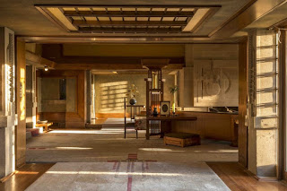
| At Frank Lloyd Wright's Hollyhock House in Los Angeles, a low entry ceiling—barely higher than the doorways—supercharges the drama of entering the soaring living room. (1921) |
Although most building codes now require a minimum ceiling height of 7’-6” (7’-0 in kitchens, bathrooms and halls), Wright’s trick is still effective today. Try playing high-ceilinged living rooms against cozy alcoves, for example, or vaulted master bedrooms against intimate baths.
• Soft/hard. Landscape architects have long been familiar with the importance of contrasting plants against “hardscaping” such as brick or stone. Architectural interiors can benefit from the same contrasts. During the Victorian era, interiors were smothered in tapestries, rugs, velvet drapes, and overstuffed furniture. A hundred years later, during the Eighties, it was fashionable to design ascetic interiors with bare hardwood floors and uncurtained windows. The result was rooms that were cold, harsh, and uninviting. As usual, the secret lies in between. There should be just enough hard surfaces to make the soft ones appreciated.


No comments:
Post a Comment