Tuesday, August 4, 2020

HORROR VACUI: Enough Design, Already

The Fall of Babylon, an etching by
Jean Duvet, c. 1555, is often cited
as an example of horrovacui in art.
Not long ago, I handed a young architectural intern a preliminary sketch to be drafted up on the computer. It was a site plan for an agricultural research facility comprising 130 acres, about eighty acres of which were supposed to be reserved  for farmland.

A week later, as promised, I received the computer drawing. But lo and behold, the great swath of undeveloped acreage shown in the original plan had been completely filled up with a meandering web of plazas and pedestrian malls in a galaxy of arbitrary shapes—pinwheels, checkerboards, crescents, what have you. Setting aside the fact that these busy forms would only have made sense from the air, they would also have made for some rather difficult farming.

When I asked the intern why she’d added all those features unbidden, she replied:  “The plan looked so empty, I thought the client would want to see more things in it.” 

Victorian architecture is famous for its tendency to decorate
every available surface—a trait that fomented the chaste
counter-reaction known as Arts and Crafts, and later on,
the asceticism of Modernist architecture.
This is a problem that afflicts all creative people, so much so that we even have a Latin name for it: horror vacui, or fear of emptiness. Herbert Muschamp, the architecture critic of The New York Times, has called it “the driving force in contemporary American taste...(and) the major factor now shaping attitudes toward public spaces, urban spaces, and even suburban sprawl."

As Muschamp rightly perceives, horror vacui is especially pronounced among architects.  Many, like my young drafter, think that if they don’t fills up every space with an avalanche of ideas and images, however unrelated to the program, they’ve somehow fallen short of their creative charge.

The pendulum swung wildly to the opposite extreme with the
advent of Modernist architecture—and once again,
too much ( or in this case, or too little)
brought on today's distinct lean toward horror vacui.
In fact, just the opposite is true. Architecture is a process of reduction, not just compilation. Ideally, the architect distills a complex set of requirements into the simplest form that will both satisfy the client’s needs and offer some measure of personal artistic grace. The avalanche of ideas has its place early in the process, but as things progress, design features that aren’t essential—whether for function or effect—fall away, leaving the final polished kernel of a solution. When carried out with skill, this process doesn’t preclude fanciful ideas, but it does preclude dysfunctional and clumsy ones. 

Of course, today’s designers aren’t the only ones afflicted with horror vacui—it’s a tendency that waxes and wanes over decades. Victorian architects, for instance, couldn’t bear to see an unadorned surface. The dawning twentieth century brought a counter-reaction to this compulsive decoration; it began with the Mission Revival and Craftsman styles and reached its zenith with International Style Modernism, whose practitioners turned architectural reduction into an art form.  
There is a middle ground, of course—in this Spanish Revival
home dating from the 1920s, for example, the plain wall
surfaces serve to intensify the effect of the other elements.

Ironically, it’s precisely this Modernist austerity that’s sent us hurtling back toward the frenetic gimcrackery so evident in contemporary design. And while architecture without complexity is dull, architecture that’s layer upon layer of complexity is simply meaningless.  

A house on the Greek island of
Mykonos: No fear of plain surfaces here.
As in so many other things, the answer lies in striking a balance. Some of our era’s most idealized domestic architecture—rural French farmhouses, say, or those much-admired vernacular hillside towns in Italy or Greece—are about as spare and simple as could be while still suiting their purpose. Against such a clean sharp background, a single flowerpot or bit of filigreed ironwork fairly bursts with ornamental power.  

Alas, like my young intern, many architects still grow fidgety at the sight of a plain white wall, much less an empty plot of land. That’s too bad because, more often than we’d like to think, the best designing we can do is none at all. 

Monday, July 27, 2020

THE FAD FACTORY

When was the last time you saw Avocado appliances?
In 1962, they were the hottest trend going.
We all know that nothing looks more dated than last year’s red-hot style. What’s not so obvious is why consumer styles-- whether clothes, curtains, or cars--come and go with such cyclical certainty. More often than not, the seeds of new design trends are carefully nurtured by their respective industries to spur sales, and then disseminated via design magazines, television, social media, and the like. Clever marketing encourages consumers to believe that they’re the ones driving these trends, when in fact it’s more often the other way around.  

Compare that with today: Gray, gray, gray.
Perhaps a reflection of the current
American psyche.
Once a hot trend inevitably runs its course, another comes along to replace it. Those who literally bought into the previous fashion cycle are left with outmoded items that once again beg to be replaced with more current ones, thereby starting the cycle anew.  

The American auto industry brilliantly exploited this marketing ploy during the postwar era. Back then, Detroit’s enormous, chrome-laden cars were heavily restyled each and every year, ensuring that the driver of last year’s model would be acutely aware that his near-new car was already out of date. While most people are now wise to the role of planned obsolescence in selling cars, not so many are aware that the makers of domestic products play the same marketing game.  

The 1956 Buck featured a grille badge that showed
the car's model year—a pretty nifty way to remind
Buick owners that they were driving last year's model
once 1957 rolled around.
Take kitchen appliances, for example. Since a washing machine or refrigerator will ordinarily last decades, the simplest way to coax consumers into buying a new one is to make them embarrassed at how dated the old one looks. Accordingly, over the years, we’ve seen a whole succession of color and finish fads come and go, each by turns energetically touted as the ultimate in chic. They’ve ranged from the basic sanitary-white appliances of the late 1940s through Turquoise, Coppertone, Advocado, Harvest Gold, Almond, Black, back to white again.  

Did I say Avocade was the hottest trend?
Actually, by 1966, it was Harvest Gold.
Of course, merely ending up right where you started wouldn’t carry much urgency as a fashion statement, so appliance makers found a new sales angle: Why, this wasn’t just plain old white--it was White on White. Today most appliances come in stainless steel, but that's not a function of fashion anymore—it's only because it saves manufacturers the labor and environmental expense of painting their products.    

Given that any fashionable item is doomed to look uniquely dated in a very short time, one wonders why people continue to be so easily swayed by the artificial dictates of fashion, rather than recognizing it for the finely-tuned  sham that it is.  

The vessel sink—no doubt one of the silliest
plumbing fads in history. But don't worry—
it  won't be around for long.
At the root of this susceptibility lies, I think, an unfounded lack of confidence in our ability to judge for ourselves. Dig even deeper, and we may find a reluctance to trust one of our most important design tools:  our own intuition.  For instance, when clients bring me a range of color choices for, say, countertops, they’ll dutifully run through the ones they perceive to be in step with current design trends. But at some point, they’ll show me the one color that really makes their eyes light up, which they’ll resignedly dismiss with some comment such as, “I absolutely LOVE this color, but I know it’s way out of fashion.”

I couldn’t think of a better reason to choose it.

Tuesday, July 21, 2020

ARCHITECTURAL INCHES: No Skimping Allowed

Nice try—but illegal. The treads need to be at least 9" deep,
and the risers can't be higher than 8".
I often get calls from nice folks who’ve drawn up their own plans and want me to check them for problems. Some of these designs are wonderfully creative, yet virtually all of them are sabotaged by the same basic shortcomings: people never allow enough space for hallways, staircases, kitchens, or baths. 

This is what a four-foot kitchen aisle looks like.
It sounds wide, but it isn't.
Stairs are undoubtedly the biggest booby trap for neophyte planners. Even a relatively steep, straight stair climbing your basic nine-foot-high story requires a bare minimum floor area of three by ten feet--and this doesn’t include the top and bottom landings or the thickness of the enclosing walls. L- or U-shaped stairs need even more room. Yet people routinely show me designs for second-story additions in which the entire staircase is miraculously packed into a linen closet. They’re usually crestfallen to learn that, in fact, the new second-floor bedroom they thought they were adding will only be replacing the one wiped out by the stairs. 
No less than 36" wide, please.
That's the code minimum.

Kitchens are typically overcrowded as well. The absolute minimum aisle width between facing countertops—even those on islands—is four feet. Although this may seem excessive on paper, it won’t be once you’ve got doors, drawers, and dishwasher racks projecting into the aisle, not to mention a few bystanders “helping” you cook. Nor should sinks and cooktops have less than eighteen inches of counter space on either side—and again, this includes islands.  

A double-loaded walk in closet (one with
clothes rods on two sides) requires a minimum
width of 7 feet. Period.
Even when they know there really isn’t enough room to accommodate everything they want, amateur planners will often try to cheat their way out of the problem by cannibalizing other spaces. Clothes closets are a common victim: although they need to be at least two feet deep, people are always trying to whittle a few inches off  them to buy space somewhere else.  Forget it—jacket sleeves cannot be fooled by this strategy.    

Other immutable rock-bottom minimums:

•  Foyers need to be at least six by six feet.

 •  Hallways, like stairs, can be no less than three feet wide.

Sorry, not kosher. By code, a toilet has to sit in a space
that's no less than 30 inches wide.
•  Walk-in closets need to be at least five feet wide for a single-loaded arrangement, and seven feet wide for a double-loaded one. 

•  Double lavatory sinks require a countertop at least six feet wide.  Never mind those dinky five-foot examples you find at the big-box store--that’s just wishful thinking. 

•  Toilets should occupy a space at least 30 inches wide when between a wall and a counter, and at least 36 inches wide when between two walls.

•  Stall showers require a space no less that three feet square; tubs and tub/showers need at least 2 foot 8 inches by 5 feet.

•  Garages must be at least 19 feet deep inside.  And don’t dream of trying to squeeze a furnace, water heater, or washer and dryer into that minimum, either; if you do, only a Smart car will ever fit in there.

Lavatory sinks: Make them round or make them square,
but for heaven's sake, make the counter at least six feet wide.
When space is tight, both architects and amateurs can be tempted to fudge minimum dimensions by a few inches here or there. Don’t.  In fact, it’s good practice to allow a few inches more than you need, since finishes, trim, and unexpected errors or obstructions often conspire to nibble away preciousroom from a space that’s already squeezed. If you can’t accomodate the above minimums, you may need to rethink your wish list. Better to throw a few things overboard than to sink the whole ship.

Tuesday, July 14, 2020

A FEW LESSONS FROM FRANK LLOYD WRIGHT

Taliesin, Frank Lloyd Wright's home at
Spring Green, Wisconsin: Not on the hill, but of the hill.
Image: Taliesin Preservation Inc.
“The physician can bury his mistakes,” Frank Lloyd Wright told the New York Times in 1953,  “but the architect can only advise his client to plant vines.”  

Such wisecracking aside, Wright probably new better than most architects the value of integrating nature into his work, and not just as a remedy for aesthetic failure.  

A visit to Taliesin, the home he began building in central Wisconsin in 1911, makes this amply clear:  The house is wrapped around the crest of a hill on three sides--”not on the hill, but of the hill”, as Wright liked to say--and the erstwhile farmboy’s love for nature informs every nook and cranny of the place. Wright continued working on Taliesin right up to his death in 1959.  

Like all great examples of modernist architecture,
Taliesin is truly inseparable from its site.
Whether cottage or mansion, a truly livable house should, like Taliesin, seem inseperable from its site.  Sometimes, the simple passage of time and the attendant growth of planting are enough to create this effect, as many an overgrown bungalow will testify.  If you can’t wait around fifty years, however, there are also a number of design strategies that can help weave a new home or addition into its site right from the start.
Broad steps and terraces seamlessly join the house
to the outdoors despite challenging changes in elevation.

•   Build decks or terraces as close as possible to the interior floor level, rather than having a back-porch-like stair leading down to them.  Since a house that’s markedly above the outside ground level can feel cut off from the outdoors, creating outdoor space that’s flush with the ground floor will both visually expand the interior space and help integrate it with the surroundings.  

Wright was a master at extending landscape elements
out from the house itself, expanding its feeling of space
and blurring the lines between indoors and out.
If the vertical distance to the outside grade is more than a couple of feet, consider having several levels of decks or terraces that gradually step down to the ground.  Use level changes of two or at most three steps, each no more than six inches high, and avoid using single steps, as they can create a tripping hazard.  Integrate planters or beds for trees and shrubs into the layout to help visually smooth the transition from indoors to out.

•  Except where there are doors leading outside, don’t install paving or other ground-level hardscaping right up to your home’s exterior walls.  A house with bare paving meeting bare walls has about as much connection to its setting as the hotel on a Monopoly board.  A better approach is to leave a planting bed at least three feet wide between the  foundation and any paving.  Make sure you provide drainage so this area doesn’t become a swamp during the rainy season.  

Taliesin surround a garden courtyard that forms a series of
outdoor rooms—a design strategy common in Asia,
but far too seldom seen in the West.
•  Extend architectural details such as walls, colonnades, or porches from the house into the surrounding landscape.  One of Wright’s favorite techniques was to have low walls radiating root-like from the building, visually tying it to its site.  Often, these walls also formed integral planters that helped from a transition to the natural landscape.  

Traditional architects could be equally adept at this technique: Spanish Revival homes, for example, often featured an arcade or a pergola extending from the house into the garden, or a covered veranda that formed a space halfway between indoors and out.

•  Lastly, always think of your house as an integral part of its site, rather than being an object placed on top of it.  Plan the garden as a series of outdoor rooms that are an extension of the indoor ones, and make the ones nearest the house serve as transition points between inside and out.


Monday, July 6, 2020

WHY AMERICAN HOMES STOPPED GETTING PLASTERED

Old-style lath and plaster construction, seen
from the back of the wall. The plaster squeezed
between the laths formed a "key" that held
the finish to the wall—or occasionally, not.
Perhaps the most singular trait of American homes is the flimsy, cereal-box thud of our gypsum board walls. No one else in the world has anything quite like them—and I don't mean that as a compliment. Mind you, if it weren’t for World War II, our walls might not sound quite so hollow.  

Before the war, American homes were routinely plastered inside--a painstaking process that first required nailing thousands of feet of wooden strips known as lath to the ceiling and walls of every room.  

Things you can do with plaster that you can't with drywall.
All those movie palace interiors of the 1920a weren't really
built with stone, marble, and gilt, but with painted plaster.

The lath was covered with a coarse layer of plaster called the “scratch coat”.  The wet plaster squeezed through the gaps in the lath, locking it to the walls and ceiling.  Days later, when the scratch coat was dry, a second “brown coat” was applied to make the surfaces roughly flat. This, too, had to dry for several days.  Last came the “skim coat”, a thin layer of pure white plaster that produced a smooth finished surface, something like the cream cheese topping does on a cheesecake.  

Early ad for Sheetrock, before World War II gave
U.S. Gypsum the market opening they were looking for.
Depending on the weather, this process could take days or weeks, during which no other trade could work inside the house. This was how plasterwork had been done for centuries, and there seemed no reason to change.  

Then came World War II, and with it an urgent need for military structures ranging from barracks to whole bases. Faced with shortages of both labor and material, Uncle Sam was desperate to find faster and cheaper ways to build. And since beauty was not much of an issue, eliminating plaster was an obvious starting point.

Levittown, New York under construction, circa 1946.
Enter the United States Gypsum Company, which way back in 1916 had invented a building board made of gypsum sandwiched between sheets of tough paper. After more than two decades, the product they called Sheetrock still hadn’t really caught on. Even its successful use in most of the buildings at the Chicago’s World’s Fair of 1933-34 didn’t do much for sales.  But the urgencies of wartime construction changed all that.  

As the government soon came to appreciate, Sheetrock did away with the need for wood lath, multiple plaster coats, and days and days of drying time (hence its generic name, “drywall”).  Installation was simple: After the 4x8 sheets were nailed up, the nail holes were filled, paper tape was used to cover the joints, and a textured coating was troweled on to help disguise the defects.

Gypsum board walls: They feel like cardboard, because
they are partly cardboard.
Of course, all this was only meant as a stopgap replacement for plaster, but as you’ve probably guessed, it didn’t turn out that way. By the war’s end, many builders who’d gotten used to slapping up drywall were suddenly reluctant to go back to the trouble and expense of plastering. 

What’s more, Sheetrock’s arrival coincided with the rise of modern architecture, which preferred plain, flat surfaces to the fussy moldings and reveals of prewar styles. To Modernist tastes, the fact that Sheetrock couldn’t be molded the way wet plaster could was hardly a drawback. People seemed more dismayed by the flimsy cardboardish sound of the walls in their postwar homes, but they soon got used to it.
U.S. Gypsum would like you to remember that
"Sheetrock" is their trademark, even though it's become
a virtual synonym for gypsum wallboard.

Flimsy or not, there’s no doubt that Sheetrock proved a huge boon to the postwar housing industry. Prior to the war, the typical American developer built about four houses a year.  By the late Forties, a developer like the legendary Bill Levitt was able to churn out 17,000 tract homes at Long Island’s Levittown, sell them for $7,990 , and still make a thousand dollars profit on each. Mass production was the key to the postwar housing boom, and Sheetrock helped make it happen.  

Just something to bear in mind next time your kids smash a doorknob through the bedroom wall.


Monday, June 29, 2020

THE QUALITY KILLERS

He couldn't cope: The interior corners of ceiling modlings
should be coped rather than mitered—but not like this.
A few years back, I came across a bronze plaque outside the headquarters of one of those instant internet giants. In consummate public-relations prose, its text declared the company’s absolute commitment to quality and excellence at every level, invoking all the usual corporate buzzwords of that genre. What really fixed the plaque in my memory, though, was that one of its most mundane phrases was mis-punctuated, reading “it’s ideals” instead of “its ideals”.  

Given this firm’s purported obsession with quality, you’d think they’d have given their mantra a quick proofread or two before committing it to bronze. 

This incident reminded me that a commitment to quality demands tangible final results, not just a lot of high-flying babble. It requires vigilance down to the very last detail--even to a lowly apostrophe.

Molding made of multiple parts should be
overlapped to avoid obvious joints like this.
Quality relates to architecture and construction in much the same way:  The last little details can make the difference. Hence, a project that’s going along swimmingly can still become a compete messin the last few days, because that’s when many of the parts you really notice are completed. The trouble is, this is just about the time the owner, the contractor, and yes, even the architect are tired, impatient, and rushing to get things buttoned up. 

Too often, this means that the most conspicuous details get the least effort and attention.
Here are some notorious quality killers that can sabotage a project at the last minute:

Leftover shreds of masking tape are a
sure sign of a contractor in a big hurry.
•  Moldings such as baseboard, door trim, and ceiling cove are often treated as last-minute frou-frou by harried contractors, even though they’re among the most obvious finish items.  Quality killers include inaccurate or open miters, ragged or splintered cuts, and gaps between moldings and floors, walls, or ceilings.  All standing moldings (such as door trim) should be installed plumb and square.  Running moldings (such as baseboard) should align properly and have clean, tight miters, or in the case of internal corners, coped butt cuts.  Gaps should be neatly caulked.  The last step, mind you, is seldom carried out but is a must for any quality installation.  

Heavy brush strokes shouldn't be visible in trim—a particular
problem if the paint finish is high gloss.
•  Indifferent painting is the surest way to destroy a quality job.  Ironically, although paint is the predominant finish on most houses, the painting phase is often cursed from being carried out late in the project, when money and patience are at low ebb.  Hence, workmanship suffers either because the job is rushed or because incompetent painters are hired in a misguided attempt to save money.  The quality killers:  Excessively thick or thin application, drips and runs, ragged or wavy brushwork along edges, and paint on fixtures, finish hardware, masonry, or glass.  None of these shortcomings should be tolerated.

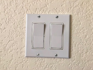
Crooked switches indicate an electrician in an all-fired
hurry to get off the job. It takes time to straighten out
the electrical devices, but if you don't, the cover plates
will always be crooked.
•  Highly conspicuous finish hardware items such as door locksets, cabinet pulls, towel bars, grilles, and the like usually get hasty treatment because they’re among the very last items installed.  The quality killers include mismatched finishes (polished brass mixed with satin brass, for instance), off-plumb or misaligned pulls and trim plates, crooked light switches and receptacles, crooked towel bars, and locks and catches that don’t engage properly. Insist that such items are neatly installed and are placed perfectly plumb, level, or square, as appropriate.

And in case you think fussing over such details is obsessive, one last remark about that would-be internet giant with the big bronze plaque:  “its” since gone out of business.

Monday, June 22, 2020

AIRPORT ARCHITECTURE: Same Old Approach

Union Station, Washington DC: In the heyday of
rail travel, you really knew you were going someplace.
(Architects: Daniel Burnham and Ernest R. Graham, 1907)
Flying isn’t what it used to be. While the coronavirus and stay-at-home orders may become the proverbial nail in the coffin for the romance of travel, things were on the decline long before that. By the 1990s, air travel had already become overly familiar, even routine; but that was before 911 made many Americans equate airplanes with doom and destruction. But there's another, literally concrete reason that flying has lost much of its romance:  The modern urban airport just isn’t the sort of place we’d like to spend time in.  

The mechanics of travel weren’t always something merely to be endured. During the heyday of the passenger railroads, arriving, departing, or even just hanging around in one of the great major terminals--whether Portland, Cincinatti, or Washington DC--was an experience to remember. A first-time visitor couldn’t help but feel thrilled in such a temple of travel. 

Exterior of the main terminal at Atlanta's Hartfield-Jackson
International Airport. It's the busiest airport in the US—
and perhaps one of the least attractive.

Approaching an unfamiliar airport, on the other hand, more often elicits a rising sense of dread. Even the most architecturally celebrated of them are maddeningly difficult to navigate. For example, after an eternity of construction bedlam, San Francisco’s airport finally boasts a magnificent new International Terminal. Yet reaching it from either the highway or from public transportation remains a nightmare for any first-time visitor.  

Most of us navigate airports by one of three methods, the only reliable one of which involves already knowing the way. Failing that, we walk around slack-jawed, trying to figure out directional signs that ought to be obvious, or else we simply follow the crowd and eventually stumble onto our objective.

Santa Barbara, California's charming municipal airport.
(Architects: William Edwards and Joseph Plunkett, 1942)
With all this confusion within, don’t even ask about what airports look like from the outside. What with changing technologies and endless reconstruction, architects long ago gave up trying to give airport exteriors a unified appearance.

Of course, there was a time when airports, like railroad terminals, were designed to look all-of-a-piece. Among the few that survive largely intact are the modest but remarkable Spanish Revival gem in Santa Barbara, California. 

Architect Eero Saarinen's TWA terminal at New York's
JFK airport really got the "architecture inspired by flight"
design theme a standard, not to say trite, theme for airports.
When Modernism hit town, though, it became fashionable for airports to be inspired by the objects they served:  aircraft.  This was a refreshing concept back in the early 1960s, when Eero Saarinen completed his famously swoopy TWA terminal at New York’s Kennedy (then Idlewild) Airport.  Alas, architects have drunk from the same well countless times since--albeit without Saarinen’s audacity--thereby turning the concept into a well-worn cliche.

In the ensuing decades, it’s become acceptable for airports to be disjointed aesthetic jumbles so long as they vaguely resemble airplanes, with lots of shiny metal, curvy plastic panels, and carpeting on the walls.  Never mind that there’s no intrinsic reason why an airport lounge should look like the cabin of a 747, any more than your garage should look like the inside of a Toyota.

Wichita, Kansa is a city long associated with aircraft
manufacture, and its airport features the usual aircraft-like
interior. But would you build your garage to look
like a Toyota? 
Today, with the growing despair over security, overcrowding of terminals and airplanes, and the now even-shakier financial shape of the airline industry, airport architecture seems likely to remain stuck in the plastic-and-stainless steel rut it has occupied for decades. 

Rail travel never did regain its cachet after World War II, and the palatial terminals of railroading’s golden age sadly gave way to mundane structures that could barely compete with the local Greyhound station.  Likewise, perhaps, the airport’s day as a romantic portal to other worlds has been doomed by the very ordinary thing that air travel has become.  Short of rocket rides to the moon, I wonder what can replace it.