Monday, September 24, 2018

INTELLIGENT HOUSE HUNTING: Getting Past Location, Location, Location

You're better off with a small sunny house
than a big one with lousy solar orientation.
Everyone’s heard that old real estate saw about “location, location, location” being the first three things to consider when you’re house-hunting. Unfortunately, good location alone won’t guarantee livability. Two other considerations come right behind location—and they’re probably not the ones you’d expect:

•  Big Deal Number One: Solar Orientation. The crucial question that determines whether a house will be livable is one that's routinely overlooked in house-hunting—namely: “Where does the sun come in?” Abundant natural light is far more important than the kind of attributes that usually preoccupy home buyers, such as room size or interior finish. Natural light is the reason a sun-filled cottage can seem infinitely more appealing than an ostentatious house with a lot of dark rooms.

The rules of good solar orientation are simple: Major living areas should face south or nearly so; kitchens and breakfast rooms should face east to southeast; garages, secondary baths, and other service rooms should face north. Of course, not every house can meet this ideal—but the closer you come, the better. 

Look past the petunias the brokers planted yesterday
and check out how things look beneath the surface.
If you’re not keen on using a compass to gauge orientation, then use your own intuition. There’s nothing flaky about judging a house on how “cheerful” it seems; more people should trust their instincts in this regard. However, to get an accurate picture, it’s important to see the house at various times during the day. A canny seller will often schedule walk-throughs when the house is brightest and most appealing; it’s up to you to see what it’s like the rest of the time.

•  Big Deal Number Two: Soundness of Structure. I’m always amazed to see buyers place such high value on fresh paint or carpets, while blithely overlooking glaring signs of structural trouble such as sloping floors or wracked doorways. It’s common for houses to receive a quick cosmetic makeover before they’re put on the market, but alas, superficial good looks don’t guarantee solid underpinnings. Learn to look past the fresh paint and hastily planted petunias to ensure that the home’s beauty is more than skin deep.

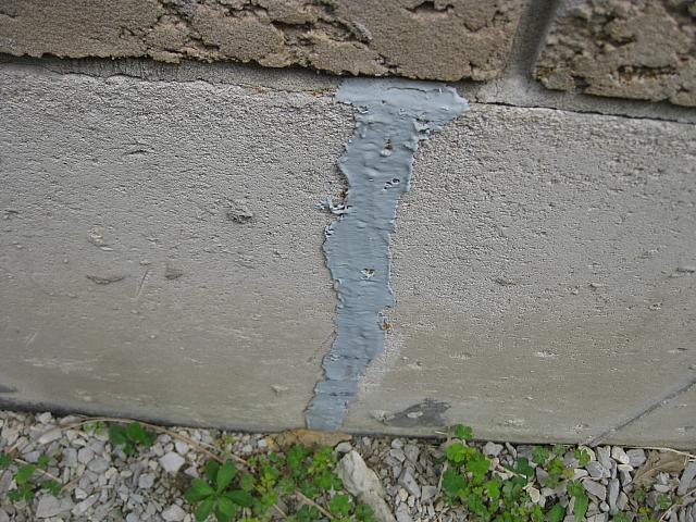
Oh oh—this is something you probably don't want to see.
Fresh paint won't make it go away.
(Image courtesy of Barrie Home Inspector)
Conversely, don’t rule out a solidly-built house because it looks a little frayed around the edges.  Cosmetic problems, in general, are easier and cheaper to remedy than structural ones. If you don’t feel confident weighing these pros and cons, look to a professional home inspector or an architect for advice. And next time you tour those open homes on Sunday and are dazzled by new paint and flowers, bear in mind that old cautionary rhyme:

See the ugly houses
on solid rock they stand
Come see my shining castle 
that’s built upon the sand.

Purple may not be your be thing, but don't rule out a solid,
well-oriented house for such superficial shortcomings.
It's just paint, and easily fixed.
(Image courtesy of AllKitchenAppliances)
•  Lastly, a few non-starters. If you do find a house with good solar orientation, a sound structure, and enough basic aesthetic appeal to put it in the running, don’t let concerns about cosmetic minutiae dissuade you from making a fine purchase. Some items generally unworthy of concern:

Unfashionable colors or finishes in areas such as paint, carpets, or countertops; outdated hardware items such as faucets, appliances, or lighting fixtures; or the absence of garage-door openers, log-lighters, and other modern-day gimmicks. Outdated hardware and finishes can be easily upgraded at reasonable cost, and high-tech bells and whistles can always be added if it’s imperative. But who knows—with a sturdy, sun-filled house underfoot, you might just learn to live without them.   


Monday, September 17, 2018

A FORGOTTEN SOLDIER: The Postwar Home Styles of the 1940s

In 1947, builder William Levitt got the postwar
housing ball rolling with his first mass-produced tract
at Levittown, New York. This is a later
and more ornate example of a Levitt home of the 1940s.
Author's note: This is another in series of occasional overviews on home styles of the past 120 years.

A half-century ago, in the gray no-man’s-land between the end of World War II and the heart of the Fabulous Fifties, there arose a humble little home style that’s been all but forgotten by three generations of buyers. For lack of a better name, we’ll call it the Postwar Tract. Over the span of barely a decade, it formed the stylistic bridge between the bolt-upright look of prewar homes and the racy, low-slung lines of the Rancher—a neat delineation in the change from prewar to postwar sensibilities.


Typical 1940s-era elevation, with close-cropped
roof overhangs, hip roof, and horizontal siding.
Architecture in transition is, in fact, is the overarching trait of Postwar Tract homes. They embody many construction firsts, most notably the introduction of drywall—originally a wartime expedient for military housing—as a replacement for labor-intensive lath and plaster interiors. Other firsts include the appearance of the much-despised slab floor in place of wood (though not all Postwar Tracts sit on slabs), as well as the first widespread use of steel windows.  
Stylistically, the Postwar Tract made do with less. Walls were thinner, overhangs shorter, detailing sparse—perhaps a bit of a Depression Era/War Shortage hangover. No matter, the flamboyant Rancher would cure that a few years later.

How can you tell if you own a Postwar Tract, or are about to? If the house was built between 1945 and 1955, case closed. If you’re not sure, look for stucco or horizontal wood siding, or a combination of these, as an exterior finish. Inside, expect to see drywall or, in early cases, gypsum lath (as opposed to wood lath). Steel casement or wooden double-hung windows having only horizontal muntins (dividing bars) are another unmistakable trait. Hardwood flooring (possibly concealed by wall-to-wall carpet, single-panel doors, and a low-pitched hip or gable roof with composition shingles are three more easy clues.


A larger, gable-roofed variant of the decade's aesthetic.
Note the oh-so-skinny 4x4 porch columns.
As with every style, the Postwar Tract has its good and bad points. Here are a sampling, with the good traits first:

•  Postwar Tract homes aren’t on anybody’s “hot” list—yet. Their spartan detailing and modest scale doesn’t garner the sort of press that Bungalows and Ranchers receive, and this anonymity in turn keeps sale prices relatively reasonable.

•  The Postwar Tract floor plan, while not exactly roomy, is simple and practical. Many examples also have generously-sized windows and hence good daylighting—a trait that many earlier styles can’t lay claim to.  

•  Postwar Tracts are less susceptible to the plumbing and wiring infirmities that plague prewar homes with more primitive technology. In general, they also have better foundations than their predecessors.  

Now, the bad news:


Another hip-roofed version. This example features a
common detail of the era, windows with horizontal
mullions.
•  Perhaps due to lingering postwar material shortages, combined with the urgent need for housing, many Postwar Tract homes have a lower finish quality than their prewar brethren. Lumber sizes in porch structures, roofs, and even door trim were held to an absolute minimum.  Inside, the early fumbling attempts at the newfangled drywall finish often left much to be desired as well. Still, for the most part, the shortcomings of the Postwar Tract are aesthetic, not structural.

•  The small scale of the parts often extends to the whole house as a whole; there’s usually little room to spare, especially in kitchens, baths and closets. One bright spot: Postwar Tracts were  built on very generous lots and are relatively easy to expand.  So if room is scarce, you can always add more.


Monday, September 10, 2018

METAPHORICAL TOUCHSTONES: Don't Design Without Them

Ray Lifchez
When I was an architecture student at Berkeley, I had a professor named Raymond Lifchez (LIF-shay) who insisted that we choose an overarching metaphor for every building we designed. Hence, we would have to begin our project presentations by dutifully reciting: “My metaphor is. . .House As A Childhood Memory,” or something of that sort. 

We used to joke about this behind the good professor’s back, coming up with inane metaphors such as “House As A Place To Live,” or “House As A House,” or my personal favorite, “House As A Final Project”.

Frank Lloyd Wright designed this
windmill on his Wisconsin farm
in 1897; its juxtaposition of
angles and circles reveals Wright's
metaphor of "Romeo and Juliet"
As the years have passed, though, Professor Lifchez's obsession with metaphors seems less and less arcane. In fact, I’m now nearly as convinced as he was that a unifying metaphor is crucial to a successful design. Without a unifying theme, a design is really just a collection of gimmicks, a way to get into the magazines for a couple of seasons.     

Too much far-out Berkeley schooling?  You decide.

To succeed over the long haul—not just for a few faddish years—a design must have integrity. The overarching metaphor accomplishes this by providing a touchstone that can be referred to whenever there’s a design decision to be made. Frank Lloyd Wright was quite keen on metaphors, having variously compared his buildings to birds, to trees—even to Romeo and Juliet. Wright felt that a building should be an integral, organic whole, not a collection of parts, and his metaphorical choices were crucial to that integrity.    

New York's Woolworth Building was conceived as a
"Cathedral of Commerce"—and looks it.
(Architect: Cass Gilbert, 1913)
Okay—perhaps you're not Frank Lloyd Wright. What practical use can you make of design metaphors? Let’s suppose you choose “House Ae A Quiet Repose” as the metaphor for your home’s design. Now, let’s say you need to decide between a vaulted ceiling or a flat ceiling in the master bedroom. A soaring vaulted ceiling certainly isn’t quiet, nor is it reposed. So—flat ceiling it is. The guiding metaphor has helped keep you on course. 

On the other hand, if you’ve chosen “House As A Springing Leopard” as your guiding metaphor, you’re going to go for that vaulted ceiling, aren’t you?  The dynamic nature of your metaphor fairly demands it. Without this kind of touchstone—a term I prefer to metaphor—a designer is adrift in a sea of choices, without any rational framework against which to measure his decision. 

Of course, it’s absolutely crucial that your metaphor be a true reflection of your personality and your wishes.  If you’re addicted to hobnobbing, choosing “House As A Quiet Repose” would just be self-delusional. Maybe what you really want is “House As Grand Central Station,” or something like that.  

Perhaps the most famous architectural metaphor,
"A House Is A Machine for Living In", is embodied
in Le Corbusier's Villa Savoye, Poissy (1931)
The point is that choosing just the right metaphor can be of enormous help in guiding your design, right down to details such as countertop materials. Would “House As A Springing Leopard” have understated counters of ivory Corian?  Probably not. Would “House As A Quiet Repose?” Much more likely. Moreover, since all your design decisions are being measured against this same yardstick, your design will necessarily be consistent.

Of course it’s possible to create a  successful design without a metaphor, just as it’s possible to be a successful person—perhaps even a president—without integrity. Eventually, however, a lack of same will come to haunt both the building and the person who’s managed to succeed without it. 

Wednesday, September 5, 2018

THE VICTORIAN HOME: Big House, Big Bills

Victorian houses: Big, because they could be.
This is the Boudrow House in Berkeley, California, c. 1889.
(Photo: Daniella Thompson)
Author's note: This is the first in a series of occasional personal reflections on various American home styles—their history, their best features, as well as their shortcomings. 

Ever wonder why Victorian houses were so big?   The answer is—because they could be. 

It’s no gag. The average house of the early nineteenth century was unassuming in scale, with modest rooms, small windows, and relatively low ceilings. But around 1840, two innovations began changing that. The first was balloon framing, a new building technique which substituted light, slender pieces of lumber—today’s 2x4s—for the massive framework of posts and beams that had been used for centuries.  

Hand-in-hand with balloon framing came the introduction of mass-produced wire nails, which superseded the old hand-wrought variety and provided the ideal fastener for the new framing method.


Those beautiful high ceilings also make it a challenge
to keep heat down at floor level.
(Image courtesy of Impressive Interior Design)
These two simple ideas had a huge impact on American architecture. Suddenly, big houses were easier and cheaper to build, and far more people could afford them. And this, combined with a growing mania for machine-made ornament, gave birth to the group of home styles we now call Victorian. In various guises, each more ornate than the last, they remained popular until the end of the nineteenth century.  

Okay—fast-forward about eighty years. After being despised for several generations, Victorian homes are once again beloved for the ir ebullient design and fine craftsmanship—so much so that even today it’s all but sacrilegious to criticize them. Yet as practical places to live, they do have some serious drawbacks. If you're in the market for a Victorian house, here are a few things to consider:
The Victorian
double-hung window:
Only vaguely airtight.

•  Energy efficiency and comfort can leave a lot to be desired. Most Victorians were built with little or no insulation, and used single-paned glass windows with, shall we say, a casual degree of airtightness. The result is chilly floors, drafty rooms and massive heating bills.  Those high, heat-trapping ceilings don’t help matters either. Such problems were recognized even at the time, and helped precipitate the trend toward smaller houses after 1900.

Bringing a Victorian up to modern standards of comfort usually means installing weatherstripping, a modern furnace, and mandated levels of floor, wall, and attic insulation, so plan on spending some serious money on these upgrades.


Knob and tube wiring, along with the usual degree
of attic insulation original to Victorians—i.e., none.
•  Utilities are often in poor condition. Most Victorian houses did not have indoor bathrooms when they were constructed, but rather had their plumbing retrofitted later. Drainage systems were often installed outside the walls and were of cast iron with rammed-lead joints. If this stopgap plumbing system hasn’t already been totally replaced, count on doing so in the near future.  

The same goes for Victorian knob-and-tube electrical systems, which suffer from inadequate amperage, brittle insulation, too few receptacles, and a host of other infirmities. In general, it’s safest to upgrade these systems to modern equipment—once again, major dollars.


The umpteen color paint scheme: Impressive,
but a sentence to perpetual maintenance.
•  Maintaining the phenomenally ornate surfaces of Victorian homes demands real dedication. All that painted gingerbread was a nightmare to maintain in 1900, but it’s an even bigger challenge now thanks to the ravages of time and today’s less durable paints. So be prepared for essentially perpetual maintenance.

•  Finally, remember that despite their substantial appearance, Victorians aren’t as nearly as earthquake resistant as modern houses. Their typically unreinforced foundations and tall basement walls are particular weak points, and seismic reinforcement is an absolute must prior to any cosmetic improvements.